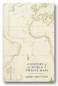
 Jerry Brotton, Professor of Renaissance Studies at Queen Mary, University of London, delivered a talk at Stanfords on his latest book, A History Of The World In Twelve Maps.
A “massive shift” in the direction of mapping is underway, with cartography’s transformation to the digital sphere causing as profound a reaction as when maps moved from manuscripts to print – especially now the online map has become essential to web navigation and search.
This is according to A History Of The World In Twelve Maps author Jerry Brotton, who believes there are parallels between today’s anxieties surrounding online mapping and the attitudes of some in the 15th and 16th centuries, when the printing press suddenly allowed people en masse to have a visual appreciation the world around them.
But what is it about maps that touches the nerve of so many? And with maps now more ubiquitous than ever, what does the future of cartography have in store?
“People are fascinated about maps, and I want to explore why that might be by looking at a wider historical context,” Brotton explains. “What happens when you go back to the Greeks, or further, to see how maps have gone through different forms of representation? Firstly scratched on a cave wall, then moulded on clay, then drawn on papyrus, then paper, then print, then lithography, then online. I want to see what endures with mapping – what is it that makes us so fascinated?”

This is the aim of A History Of The World In Twelve Maps, a book that takes 12 maps and asks whether there are abiding mapmaking principles that can be traced back to prehistoric times. The first, the Babylonian World Map, dates from 750 BC; the last, Google Earth, was updated in 2012.
“Interestingly, neither looks much like a map despite being at opposite ends of the historical scale,” Brotton says. “The Babylonian World Map – the first known surviving map of the entire world – has only recently been seen as an incredibly important object. When it was discovered, people didn’t know what it was. Google Earth, because it’s a sphere, doesn’t look like a map either.”
His book is about maps of the world – not local or regional maps – and how different historical cultures, from Europe to north Africa and south-east Asia, represented the planet in different ways. By looking beyond Greco, Roman and western traditions, Brotton was able to document lesser known but equally important mapping methods. He discovered that each approach was logical, consistent and coherent to its culture but that each, inevitably, had to make omissions.
“Any map of the world that attempts to transform the globe onto a flat piece of paper will also make distortions – quite simply, you cannot square the circle,” Brotton explains. “Choices and decisions will always be made about what will be put in and left out. I’m interested in what happened at this point – it opens up the possibility for prejudices, religious beliefs and political ideologies. I wanted to track how this happened.
 “Maps are a way of categorising the world – we look towards the horizon and wonder what’s out there. We want to abstract the world around us and make it understandable. We want to make it contained, and both the Babylonian World Map and Google Earth do this. While the latter is photo-real satellite imagery from above, once you click on or off the geopolitical boundaries it starts to become more abstract.
“Another striking parallel is the view of the world from above. Google Earth asks you to be 11,000 km above the Earth, as though you were in orbit. The Babylonian map does the same – by providing access to this view, you’re offered a divine perspective of the Earth. But as we all know, the first thing people do on Google Earth is find where they live and zoom straight in.”
World maps, then, have always responded to humans’ basic existential questions: Where am I? Why am I here? What am I doing here? “We ask the map to answer these questions for us,” Brotton continues. “Google is clever enough to know where you are so it will tilt the globe to make sure you’re at the centre of it. The Babylonian map does exactly the same thing – it’s the whole world, surrounded by the ocean. The idea is that the Earth is round, but it’s also flat. At its centre is Babel, or Babylon. Babylon is the centre of the world, everything beyond it is immaterial. There’s an enduring power in that image, which takes us all the way through to Google Earth.”
Between the Babylonian World Map and Google Earth, Brotton has compiled a collection of other important maps and publications, from Ptolemy’s Geographia to the Peters’ projection via the Hereford Mappa Mundi and the Mercator projection.
 On Ptolemy:
“What he basically concluded is that you can’t accurately map the world; that you have to make certain compromises and decide what you want on your maps. His basic grid served as a toolkit for how to take things forward. It was additive – if more land was discovered, it could simply be added in.”
On Islamic maps:
“An Islamic world map from 1086 had south at the top. Why? The Arabian Peninsula was the key inclusion – Mecca was the centre of this world. In the 10th and 11th centuries, cultures that converted to Islam were due north, so they would understand Mecca as being due absolute south. This was a theological response to how to represent the world rather than being about geometry or maps.”
On the Hereford Mappa Mundi:
“It’s a weird, amazing object made from an enormous calf skin – it’s literally a rumpled dead animal, and really the equivalent of the Islamic theological roll map. It has east at the top with the Garden of Eden. Right at the centre of the map is Jerusalem, with the idea that theological Christian time starts in the east and moves westward, with the surrounding legend describing scenes from the bible. Everything is moving westwards – this is a map about time, not space. Rather than being about finding your way from A to B, it’s about finding your way from the terrible sinful world you’re in to heaven.”
On the emergence of Chinese maps:
“In China, the emperor always faces the south. In subjection to the emperor, you look to the north. That’s why Chinese maps have traditionally had north at the top, a trend that began not long after the Islamic and Hereford theological world maps, both in China and Korea.”
On the first maps of the New World:
“Martin Waldseemüller’s map of the world from 1507 was the first to put the name ‘America’ on a separate continent surrounded by sea. Vespucci [who first demonstrated that America was a separate landmass] is seen looking down at his new continent, while Ptolemy is depicted glancing down at his old world. The map contains a weird distortion – America almost looks like a wedge of cheese with its unrealistic coastline, though what’s happened is consistent with how the world is projected. It has to be stretched and elongated to accommodate the new continent.”
On the Mercator projection:
“The distortion in Waldseemüller’s map is why you get Mercator and his very famous 1569 new projection. He called for a rectangular map to plot the spherical globe so cartography could move on from the days of Ptolemy. He knew that compromises had to be made – the image of the globe was stretched north-south until the North and South Poles were stretched to infinity. He was very open about this distortion, but because trade travelled east to west rather than north and south, it didn’t really matter.”
On the Peters projection:
“Peters’ world projection from the early 1970s, which is all about equality, is the big challenge to Mercator. A socialist historian, he argued that Mercator’s map massively privileges the developed northern world as opposed to, say, Africa. He championed equality of landmass, though his map wasn’t universally welcomed. Somebody once famously said the continents resembled long, wet ragged pieces of underwear hanging off the North Pole.”
On Google:
“I was initially absolutely seduced by what they were doing. But Google’s innovative use of mapping has become about monetising geography, and this is my big concern. Over one third of all Google searches have some geographical content to them – Where is my nearest Chinese restaurant? Where is the best hotel in Madrid? – which has seen the online map become an actionable platform for selling things.”
Jerry Brotton was speaking at our Long Acre store. To keep up to date with future talks, check out our events page.
Click here to buy A History Of The World In Twelve Maps!
 Prompted by a desire to share their scientific interests, ideas, and findings, the 33 founders of the National Geographic Society first convened in Washington, DC on January 13, 1888 to create “a society for the increase and diffusion of geographic knowledge.” Today, the Society works to inspire people to care about the planet.
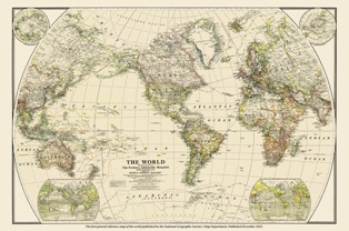 Today, National Geographic reflects the world around us through its magazines, television programs, films, music and radio, books, DVDs, exhibitions, live events, school publishing programs, interactive media and merchandise. The magazine is read by more than 60 million people each month, and the National Geographic Channel reaches 440 million households in 171 countries in 38 languages. Their digital media receives more than 20 million visitors a month. National Geographic has funded more than 10,000 scientific research, conservation and exploration projects and supports an education program promoting geographic literacy. Continue reading 125 years of National Geographic
 Last time I was writing about the excellent (if a bit geeky) maps produced by the

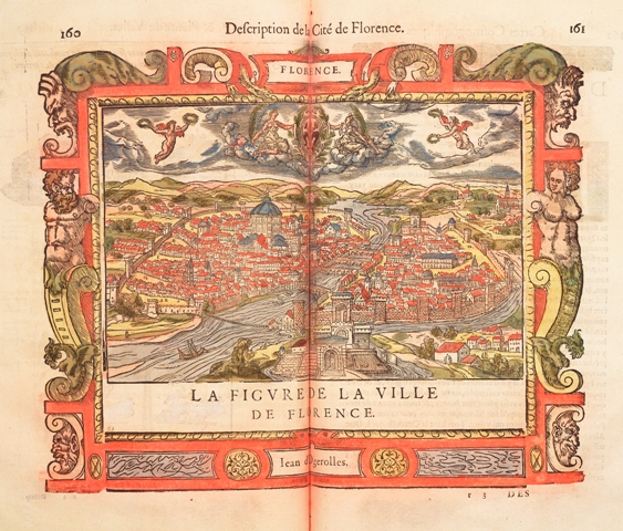 But city maps are almost as old as the city itself – and for much of history, they were not designed to help people find their way around. Prior to the Industrial Revolution, few cities were large enough to make that necessary. Despite its accuracy, the great marble map that hung in the Forum in Rome was not intended as a guide for visitors (they would have had to climb a ladder to read its upper portions) but to proclaim the imperial city’s prosperity and power.
 Here at Stanfords we use all types of mapping, and recently, we’ve become rather taken with digital mapping. Here, digital mapping specialist Craig Wareham makes the case for one of the latest developments for walkers – digital mapping on mobile phones.
 Not since William the Conqueror recorded England in the Domesday Book has there ever been such a record of the country. A record that is so detailed as to show every road, every house, and every tree – the first ever complete and continuous colour aerial photographic record.
 We get a thrill whenever we come across descriptions of the wonders of maps in the world of literature. It all started for us with the great Sir Arthur Conan Doyle, who in
 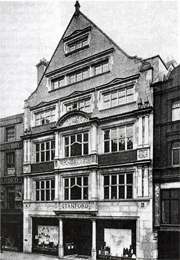 Established in 1853, Stanfords has since made and supplied maps to royalty, the military, and famous adventurers, explorers, writers, and even dolls, for over 150 years.