-by Megan Barford, Curator of Cartography at Royal Museums Greenwich and author of A is for Atlas: Wonders of Maps and Mapping.
As a map curator, I often get asked about my favourite map and it’s terribly difficult to choose. In the collection of Royal Museums Greenwich there are near-pristine sixteenth-century maps illuminated with gold and maps reduced to scraps through use at sea. There are maps that show the involvement of women in the book and print trades in eighteenth-century London, alongside maps that came out of trade union activity during the Second World War. Luckily, in my new book, A is for Atlas, I’ve been able to pick 104 favourites, organised according to alphabetical themes in a treasury of stories about map making and use, and about materials and techniques, from the thirteenth century to the present day. Here, D is for display, E is for Engraving, F is for Fake. Together the themes help us to interrogate maps and mapping in different ways, and understand the rich human stories that can be found throughout the collection of Royal Museums Greenwich.
D is for Display
While we do not know whether, where and how these particular maps were displayed, we do know that they were designed and made with display in mind. But why display a map? There are a number of possible reasons: to advertise, using maps that seek to attract attention through colour and style; to show off wealth and knowledge, by way of maps designed to impress through their sheer size; to teach, illustrating patterns to help familiarise learners with new information. The purpose of the display is linked to the material nature of the object too, whether made at the greatest expense for a limited audience or produced cheaply as an item that was never intended to last.
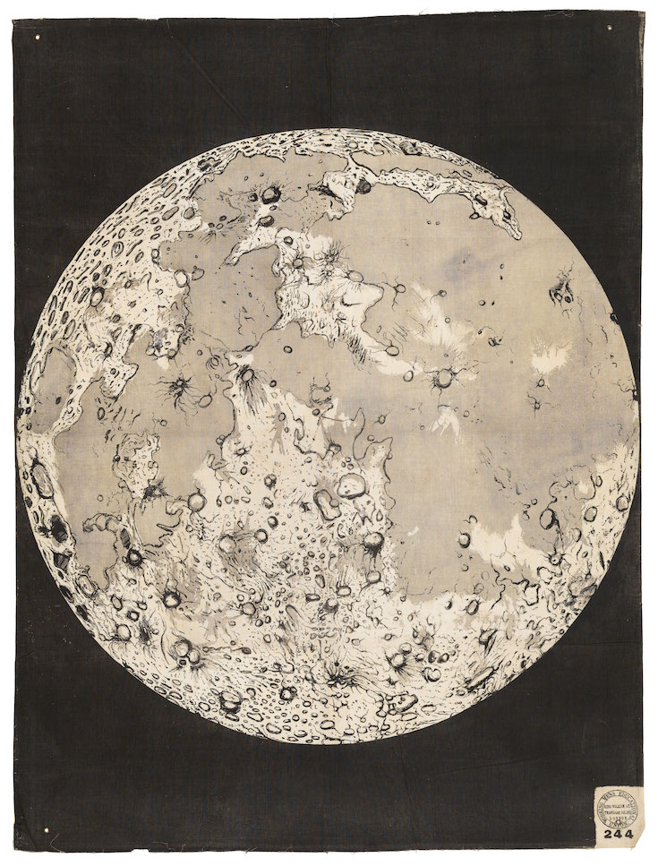
Image: © National Maritime Museum, Greenwich, London
This map of the Moon, printed on cheap, cotton cloth, was made for display during lectures on astronomy in the mid-nineteenth century. It was produced by the Working Men’s Educational Union (WMEU), which was founded in 1853 to provide resources for evening lecturers as a way of supporting mutual instruction – that is, working people teaching each other. At the time, lectures were an important form of entertainment, valued for their educational content but also for elements of show: models, images and even live experiments (topic permitting) were common parts of a lecturer’s repertoire. Suggesting that lecturers could not ‘command an audience merely by the allurements of their words’, but that the need to illustrate was ‘a tax both upon the time and purse of the lecturer’, the WMEU produced over 400 different coloured wall hangings that could be purchased individually or in sets.7 This wall hanging was part of a series concerned with the Solar System and was made in a period when telescopic observations were not only revealing more details of the Moon’s surface, but also giving rise to increasing speculation about its formation.
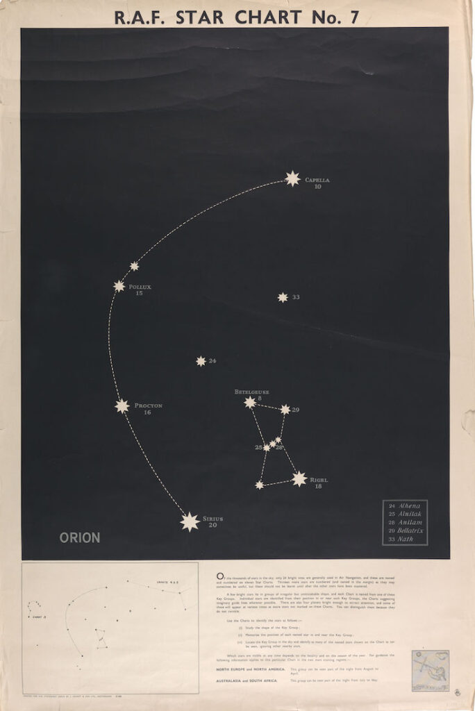
Image: © Crown copyright. Photo © National Maritime Museum, Greenwich, London
The urgent need for air navigators and pilots at the beginning of the Second World War led to the rapid expansion of training by the Royal Air Force (RAF) for new air crew. Although at the start of the War those learning to navigate did not receive instruction in astro-navigation, it soon became clear that more extensive training was needed. The Navigational Training Branch of the Air Ministry published a series of 11 charts. They were designed for display in places frequented by air crews, so that they could develop familiarity with the principal constellations and the 24 bright stars judged to be most useful for navigators. With stars named and numbered, and with any fainter stars stripped out from the black background, the charts were a visually striking aid. They also offered suggestions for how they could be used to learn the named stars (study, memorise, locate) and how to distinguish planets from stars, as and when they appear (‘they do not twinkle’). As Tee Emm, the Air Ministry Training Magazine explained, ‘it is hoped that their daily study will be of great help to all who have to navigate’, since ‘you must have a good nodding acquaintance with the stars’.
E is for Engraving
Among the many processes involved in the production of printed maps, copperplate engraving is one of the most important. It involves making lines in a smooth copper surface, using a sharp pointed instrument with a wooden handle known as a burin or graver. The use of engraving in European mapmaking began in the late fifteenth century. The fine detail that could be achieved from engraved copper plates, as well as the relative ease of correction meant that it became the standard way of making maps in Europe during the sixteenth century. It remained central to map production well into the twentieth century. Whether prepared in the 1500s or the 1900s, engraved plates demanded of their makers intensive practice and careful work.
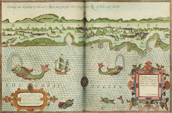
Image: © National Maritime Museum, Greenwich, London. Macpherson Collection
This chart was engraved in London by Jodocus Hondius (1563–1612). Hondius arrived in the city as a refugee, having fled religious conflict in his native Ghent, then in the southern Netherlands. Already skilled in the art, he was able to find work engraving cartographic plates, during a period in which there were very few English practitioners. It was a highly skilled activity. It took years of practice to achieve the manual control necessary to make lines of consistent depth and thickness, smooth curves and regular waves, contours and shading. Among other things, Hondius worked on the prestigious English translation of Lucas Jansz Waghenaer’s sea atlas, Spieghel der Zeevart, which was published as The Mariners Mirrour in 1588. The atlas was so influential that bound volumes of charts and sailing directions became known among English navigators as ‘waggoners’, a nod to Waghenaer. Hondius, who moved to Amsterdam in 1593, went on to develop a reputation as one of the most important cartographic engravers of the early seventeenth century.
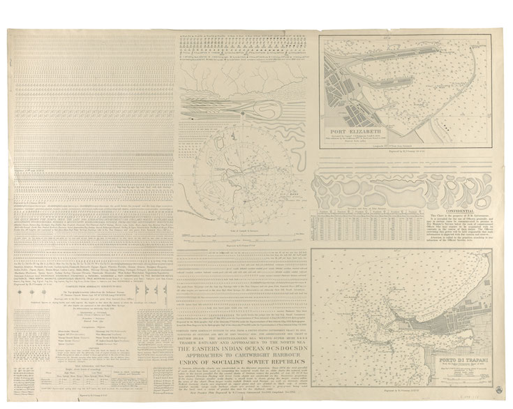
Image: Reproduced with the permission of Roy Cooney’s family. Photo © National Maritime Museum, Greenwich, London
This is a print from a ‘practice plate’ by a 16-year-old apprentice engraver, Roy Cooney. It was made in the early 1950s at the Hydrographic Department (now the United Kingdom Hydrographic Office) in Taunton, Devon, one of the most intensive chart-producing organisations in the world. It shows how particular skills were learned early in the apprenticeship. After making their tools and learning to draw letters back to front (since printing gives a reverse image of what is on the plate), apprentices started with short, straight, even lines in the first weeks, before progressing to curved lines, different styles of lettering and details of increasing complexity. Finally, these elements were combined into the small sample chart at the end of the sheet. It was only after completing a practice plate that an apprentice would be allowed to make small corrections to the plates from which navigational charts were published. After a six-year apprenticeship, they would be permitted to engrave new charts as a journeyman engraver. The Hydrographic Office had worked with engraved copper plates since the publication of its first chart in 1800. For many decades the Hydrographic Office used newer, cheaper methods of chart production alongside engraving, but the engraving department was finally disbanded in 1981 out of preference for these more modern technologies.
F is for Fake
Fake, forgery, facsimile. These are the three ‘Fs’ of maps that are not quite what they seem: forgeries, sometimes called ‘deliberate fakes’, are made with an intent to deceive; fakes are a broader category – objects interpreted to be original, regardless of the intent of the maker; facsimiles, meanwhile, are produced as exact copies for historical or scientific purposes and generally not intended to pass, or be received as, originals. Some of the objects here were previously thought to be genuine but have since been identified as fakes. Research into counterfeits and imitations often reveals them to be remarkable in their own right. In many cases, considerable care goes into producing a fake, either by making use of traditional techniques and tools to create something convincing or by using new technologies of copying. Other objects, facsimiles rather than original maps and globes, were never intended to deceive and have their own stories and purpose.
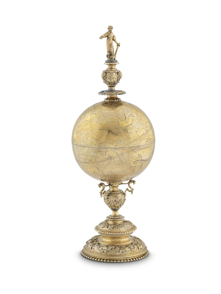
Image: © National Maritime Museum, Greenwich, London. Caird Collection
Goblet globes, highly valued in early modern Europe, have always been collectors’ items. This globe is a reproduction, made using a technique known as electrotyping, an electrochemical process developed in the nineteenth century. It involves the even transfer of particles of metal to a mould by an electric current, enabling extremely precise replicas to be made. It was, for a time, extremely popular with museums. The Victoria and Albert Museum in London promoted a programme for reproducing important works of art ‘for the benefit of museums of all countries’, with the idea that replicas could be shared with international, regional and local museums to facilitate study. Electrotyping companies, keen to advertise their prowess as makers of incredibly precise copies, tended to stamp the objects they produced for study so there was no way they could pass as the real thing. This globe, not stamped in this way, is thought to be a ‘deliberate fake’, intended to be sold
and bought as an early seventeenth-century original rather than as a nineteenth-century copy made using the latest technology.
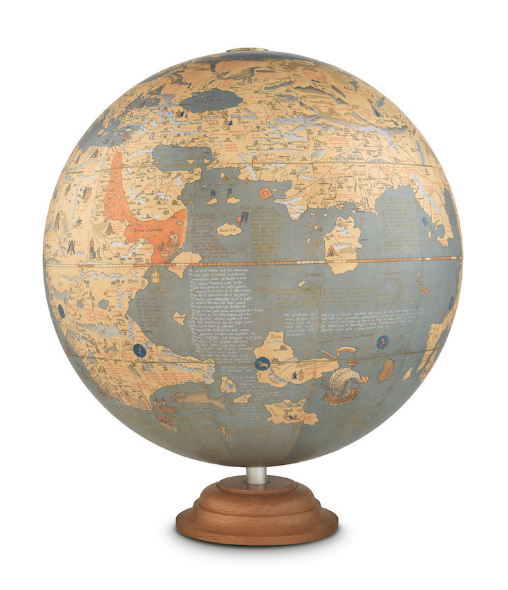
Image: © National Maritime Museum, Greenwich, London. Caird Collection
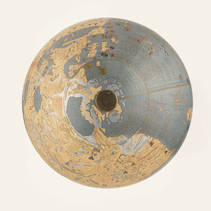
Image: © National Maritime Museum, Greenwich, London. Caird Collection
The earliest known terrestrial globe, Martin Behaim’s ‘Erdapfel’, or earth-apple, has long held fascination for geographers and historians. Made in 1492, before Europeans knew of the existence of the Americas, it brings together geographical knowledge from ancient texts and medieval travel accounts. Extensively annotated by Behaim, it gives good insight into a German scholarly world view at the end of the fifteenth century. The first known copy of the globe was made in 1770; copies are still being made today. This facsimile uses gores published in 1908, which were the main way that scholars accessed Behaim’s globe for much of the twentieth century. Ernst Ravenstein (1834–1913), who made the gores, gave a close account of how he did it: tracing and photographing an existing facsimile; laboriously comparing those images with the original. He made critical editorial decisions, too: the colours are vibrant, not faded; signs of wear are not present; place names added to the globe after 1492 were omitted; names Ravenstein felt probably were on the globe originally were included. As Ravenstein himself wrote, ‘I am fully aware that if the definition of etymologists of a facsimile as an “exact copy or likeness” be insisted upon, the copy or version now produced cannot claim that description.’ The gores were produced from the closest study of the globe up to that point. Although only 510 of these copies were produced, their greater accessibility meant that they were the main object of study for those interested in Behaim’s earth-apple, rather than the original. In producing his facsimile, Ravenstein departed from the object in an attempt to get back to something that no longer existed and possibly never had. As a critical edition, albeit a spherical one, this globe raises questions about the very meaning of originality.

A is for Atlas by Megan Barford is available now for £35.
Watch Megan introduce A is for Atlas: