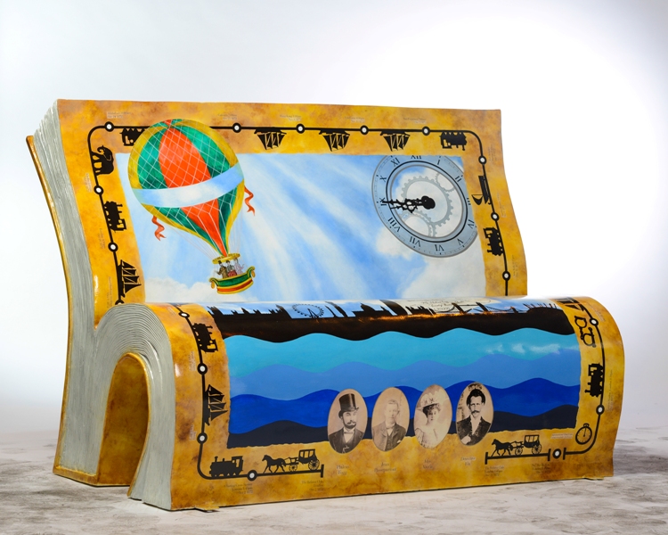
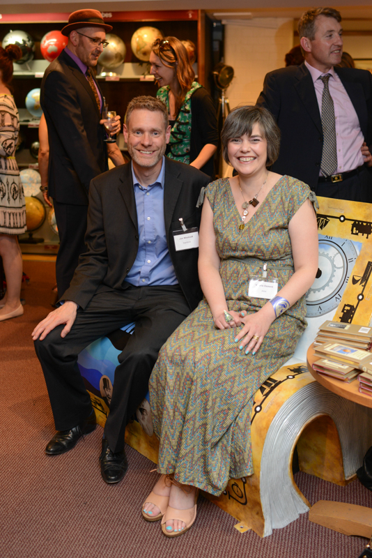
 Valerie Osment, the artist who created the wonderful ‘Around the World in 80 Days’ BookBench we have in our Long acre store shares her inspiration with us and explains the process involved.
The BookBench’s design pays homage to Jules Verne’s colourful adventure novel of the same name, where Phileas Fogg of London and his French valet Passepatout attempt to circumnavigate the world in 80 days on a £20,000 wager. Inspired by a desire to create an eye-catching pictorial realisation true to the classic tale, I wanted to offer a tantalising story synopsis to the viewer whilst enticing those that hadn’t read the novel to do so.
Published in 1873, with Verne setting the story one year earlier, my design purposefully acknowledges the iconic symbol of the hot air balloon. Mention Phileas Fogg and you automatically think ‘hot air balloon’, the association is just so engrained within the character be it on a crisp packet, in a film or a cartoon. But whilst reading the original novel for design idea research, meticulously flipping pages back and forth to pinpoint exact ports of call, arrival/departure times and transport modes utilised, key plotline elements, no balloon was to be found. As I approached the end of the book with confusion and a little worry – I had decided early on that the balloon would be my dominant visual lynchpin – I decided to google it. And there appeared my answer. The hot air balloon was never actually used by but introduced by the popular 1956 film adaption and has been repeatedly used by subsequent others ever since, hence becoming part of the mythology of the story. Finding this fact quite fascinating, I felt that this was in itself a significant enough reason for it still to be a central feature of my design.
Indeed, it was the ‘balloon discovery’ that initialised the idea to juxtaposed old fashioned Victorian-esque imagery with a contemporary styled one to reflect both the era of the original novel and the many adaptations that continue to follow to the present day. On the bench front a steampunk styled clock marks the race’s so significant start and finish time. An old fashioned net covered hot air balloon flies over a contrasting silhouette skyline of today’s London, the River Thames graphically portrayed as four different coloured wavy blue bands.
Fogg’s reward cheque hovers behind Tower Bridge within sight as if having just floated down from the puffy clouds. Dated with the day they must be back in London, it awaits, ready to be collected should the intrepid travellers arrive back in time before the deadline passes. The artwork for the cheque is executed in a script and gothic font in keeping with the late 1800’s and based upon a real one from the Victorian period.
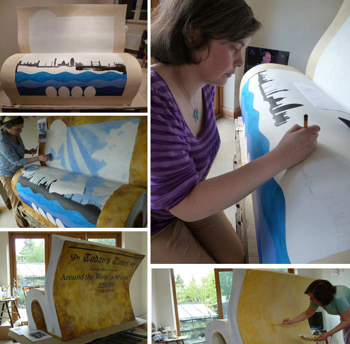
 To complete the Bench front imagery, I chose to frame the scene with an ‘aged broadsheet’ border. This effect was achieved by applying five layers of the same paint colour on top of each other, toned from light to dark. By using the same colouration as for the newspaper’s ‘stop press’ front page seen on the BookBench back, a harmonious visual link is made between the two.
The ‘broadsheet’ border depicts a timeline of the adventurer’s route and includes four centrally positioned sepia vignette Victorian portraits of the book’s main characters: Phileas Fogg, Jean Passepatout, Mrs Aouda and Detective Fix. Inspired by the London Underground map, ‘pit stop’ circles reveal each destination Fogg and his companions visit, what transport they used to get there and the all important arrival time. Like the skyline, the transport images are styled upon modern road sign iconography to link past with present again and to signify that the novel is just as exciting to read today as it was in Verne’s time.
The back of the BookBench is illustrated as the front page of a popular Victorian broadsheet, the fictional ‘Today’s Times’ and takes direct inspiration from Verne’s story. Verne writes how news of the £20,000 wager and Fogg’s adventure become the talk of London with the press printing stories about an Englishman’s attempt to travel around the world in eighty days. Enticing the viewer in, the novel’s title becomes the ‘stop press’ newspaper headline, the article thus holding a dual purpose: whilst it reports on the exciting, if a little unbelievable news of the day as a newspaper would, it also serves as the novel’s foreword to the BookBench viewer reading it.
With a sub-story telling news of a robbery at the Bank of England – a crucial plot element, also found on the ‘Today’s Times’ front page is an original 19th century Stanfords advert for ordinance survey maps. Provided by the company from its archives, Stanfords suggested incorporating the ad within the newspaper imagery and I was more than happy to do so. As the original advert only existing as a low res scan, I had to digitally recreate it to make it suitable for the Bench. However, the ‘new’ version is virtually identical in its layout, font and typographic style. Established in 1853, Stanfords map and travel store is now over 160 years old and would have been selling maps from its Charing Cross shop (pre move to Covent Garden in 1901) when Jules Verne wrote ’80 days’. Perhaps Fogg used a Stanford map to circumnavigate the globe!
Learn more about the National Literacy Trust‘s Books About Town Project here>
As a child, this book was one of my favourites of all Verne’s work, and was read and re-read many times. At last, after sixty years, you have pinned down the traitorious treatment of the original book. We can blame the introduction of a baloon squarely on the 1956 film (50’s films got away with a lot). So thanks for squareing this, though I am sorry Verne’s legacy has been spoiled by the perpetuation of this myth.